Microsoft Dynamics CRM 2013 comes with many charts out-of-box to help you visualize your data. Also, just as you can create custom system and personal views, it's also possible to create your own custom charts. You can take the visualization a step further by modifying chart XML in CRM 2013, resulting in seemingly endless possibilities.
Let's start with the basics. What can you modify in a chart?
- Colors
- Labels
- Show/Hide/Format Values
- X and Y Axis
Now we'll walk through some examples of working with a chart's XML. (The examples below will show the opportunity entity.)
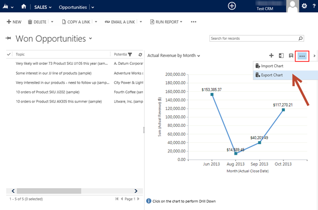
How to Export a Chart's XML
- Navigate to Opportunities and expand the Charts pane on the right-hand side.
- Select the chart you want to modify and click the Command Bar dropdown.
-
Click Export Chart. Note that this will be for modifying personal charts.
- Save the file.
- Open the file in a program to edit the XML. You can use Visual Studio, but you can also use Notepad. Do not open in Excel.
For System Charts
- Create a new solution with the entities and charts you want to modify.
- Export the solution.
- Open the customizations.xml file to access the chart XML.
How to Import modified Chart XML
- Navigate to Opportunities and expand the Charts pane on the right-hand side.
- In the Command Bar dropdown, click Import Chart.
- Upload your saved .xml file. Note that this will create a new personal chart.
For System Charts
- Save the changes made in the customizations.xml file
- Import the solution with the modified xml file
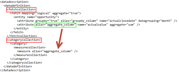
Overview of the Main Parts of the XML
Between the and tags, the main elements are:
- -- This holds the FetchXML query to retrieve data for the chart. This is also where the grouping and ordering is designated. Data filters can be applied here in addition to filters defined in the view.
- -- Each series in the chart will have a . Each measurecollection maps to a designated (vertical or Y-axis)
Also note that each attribute has an 'alias' that is referenced throughout the XML.
The next important part of the XML is between the and tags. The main elements are:
- -- If it is a single-series chart, only one will be defined. Here we can modify the colors, labels, border.
- -- Defines the labeling for the Y-Axis.
- -- Defines the labeling for the X-Axis.
- </strong> -- Here you can modify the labeling for the title of the chart.</li>
</ul>
<p><img decoding="async" alt="" src="https://powerobjects.com/wp-content/uploads/2013/11/110113_1652_ModifyingCh3.png" /></p>
<h2>XML Modifications</h2>
<p><strong>Color<br />
</strong></p>
<p>You can change colors for just about any line, label, or bar in a chart. Notice that the colors by default use numbers to define the color to use. Rather than using those numbers, it may be easier to use text. A library of all the possible colors can be found <a href="http://msdn.microsoft.com/en-us/library/system.drawing.color(v=vs.110).aspx">here</a>.</p>
<p>For example, let's change the line color on the <strong>Actual Revenue by Month</strong> chart. I'll change the color of the <Series> to <strong>YellowGreen</strong>, as well as the y-axis title, and line color to <strong>Red </strong>(XML below).</p>
<p><img decoding="async" alt="" src="https://powerobjects.com/wp-content/uploads/2013/11/110113_1652_ModifyingCh4.png" /></p>
<p>Here is what it looks like once changes imported:</p>
<p><img decoding="async" alt="" src="https://powerobjects.com/wp-content/uploads/2013/11/110113_1652_ModifyingCh5.png" /></p>
<p>We also have separate blog on <a href="https://powerobjects.com/blog/2012/12/05/customize-colors-indynamics-crm-charts/">customizing colors in Dynamics CRM charts</a> that you can reference.</p>
<p><strong>Labels<br />
</strong></p>
<p>Not only can we change the color for labels, we can change the font, size, and even hide a label. A library of title properties can be found <a href="http://msdn.microsoft.com/en-us/library/system.windows.forms.datavisualization.charting.title_properties(v=vs.110).aspx">here</a>.</p>
<p>The format required for fonts is <strong>Font="font name, font size"</strong>. In the example blow, I'll change the font for Y-Axis to <strong>TitleFont ="Tacoma, 35 px".<br />
</strong></p>
<p><img decoding="async" alt="" src="https://powerobjects.com/wp-content/uploads/2013/11/110113_1652_ModifyingCh6.png" /></p>
<p>Here's what it looks like once the changes are imported:</p>
<p><img decoding="async" alt="" src="https://powerobjects.com/wp-content/uploads/2013/11/110113_1652_ModifyingCh7.png" /></p>
<p><strong>Hiding Labels and Values<br />
</strong></p>
<p>The <strong>IsValueShownAsLabel</strong> property displays or hides values on a chart. (<strong>True</strong> displays the values, <strong>False</strong> hides the values.) To hide labels on the axes, or anywhere else, use the <strong>Color</strong> property and set it to <strong>Transparent.</strong></p>
<p>In this example, we will hide the values by using <strong>IsValueShownAsLabel="False".</strong> To hide the X and Y axis titles, use <strong>TitleForeColor="Transparent".<br />
</strong></p>
<p><img decoding="async" alt="" src="https://powerobjects.com/wp-content/uploads/2013/11/110113_1652_ModifyingCh8.png" /></p>
<p>Once imported, it looks like this:</p>
<p><img decoding="async" alt="" src="https://powerobjects.com/wp-content/uploads/2013/11/110113_1652_ModifyingCh9.png" /></p>
<p>This covers many of the basics to personalize your charts in Dynamics CRM. If you are looking for more general information on charts, you can reference our <a href="http://crmhowto.powerobjectsweb.com/stg/crm-how-to/search-and-analyze/introduction-to-charts/">CRM How-to Portal</a>.</p>
<p>Happy CRM'ing!</p>
</span></div><div id="div_block-835-41" class="ct-div-block" ><div id="code_block-844-41" class="ct-code-block" ></div></div><div id="div_block-771-41" class="ct-div-block" ><div id="shortcode-772-41" class="ct-shortcode" ><div class="essb_links essb_displayed_shortcode essb_share essb_template_clear-retina essb_template_lollipop-retina essb_2132063536 essb_size_m essb_links_right essb_nospace print-no" id="essb_displayed_shortcode_2132063536" data-essb-postid="52141" data-essb-position="shortcode" data-essb-button-style="button" data-essb-template="clear-retina essb_template_lollipop-retina" data-essb-counter-pos="hidden" data-essb-url="https://microsoft-business-applications.hcltech.com/customizing/modifying-chart-xml-in-crm-2013the-basics/" data-essb-fullurl="https://microsoft-business-applications.hcltech.com/customizing/modifying-chart-xml-in-crm-2013the-basics/" data-essb-instance="2132063536"><ul class="essb_links_list"><li class="essb_item essb_link_facebook nolightbox"> <a href="https://www.facebook.com/sharer/sharer.php?u=https%3A%2F%2Fmicrosoft-business-applications.hcltech.com%2Fcustomizing%2Fmodifying-chart-xml-in-crm-2013the-basics%2F&t=Modifying+Chart+XML+in+CRM+2013+%E2%80%94+The+Basics" title="Share on Facebook" onclick="essb.window('https://www.facebook.com/sharer/sharer.php?u=https%3A%2F%2Fmicrosoft-business-applications.hcltech.com%2Fcustomizing%2Fmodifying-chart-xml-in-crm-2013the-basics%2F&t=Modifying+Chart+XML+in+CRM+2013+%E2%80%94+The+Basics','facebook','2132063536'); return false;" target="_blank" rel="nofollow" class="nolightbox" ><span class="essb_icon essb_icon_facebook"></span><span class="essb_network_name">Facebook</span></a></li><li class="essb_item essb_link_twitter nolightbox"> <a href="#" title="Share on Twitter" onclick="essb.window('https://twitter.com/intent/tweet?text=Modifying%20Chart%20XML%20in%20CRM%202013%20—%20The%20Basics&url=https%3A%2F%2Fmicrosoft-business-applications.hcltech.com%2Fcustomizing%2Fmodifying-chart-xml-in-crm-2013the-basics%2F&counturl=https%3A%2F%2Fmicrosoft-business-applications.hcltech.com%2Fcustomizing%2Fmodifying-chart-xml-in-crm-2013the-basics%2F','twitter','2132063536'); return false;" target="_blank" rel="nofollow" class="nolightbox" ><span class="essb_icon essb_icon_twitter"></span><span class="essb_network_name">Twitter</span></a></li><li class="essb_item essb_link_linkedin nolightbox"> <a href="https://www.linkedin.com/shareArticle?mini=true&ro=true&trk=EasySocialShareButtons&title=Modifying+Chart+XML+in+CRM+2013+%E2%80%94+The+Basics&url=https%3A%2F%2Fmicrosoft-business-applications.hcltech.com%2Fcustomizing%2Fmodifying-chart-xml-in-crm-2013the-basics%2F" title="Share on LinkedIn" onclick="essb.window('https://www.linkedin.com/shareArticle?mini=true&ro=true&trk=EasySocialShareButtons&title=Modifying+Chart+XML+in+CRM+2013+%E2%80%94+The+Basics&url=https%3A%2F%2Fmicrosoft-business-applications.hcltech.com%2Fcustomizing%2Fmodifying-chart-xml-in-crm-2013the-basics%2F','linkedin','2132063536'); return false;" target="_blank" rel="nofollow" class="nolightbox" ><span class="essb_icon essb_icon_linkedin"></span><span class="essb_network_name">LinkedIn</span></a></li><li class="essb_item essb_link_yammer nolightbox"> <a href="https://www.yammer.com/messages/new?login=true&trk_event=yammer_share&status=Modifying%20Chart%20XML%20in%20CRM%202013%20—%20The%20Basics https%3A%2F%2Fmicrosoft-business-applications.hcltech.com%2Fcustomizing%2Fmodifying-chart-xml-in-crm-2013the-basics%2F" title="Share on Yammer" onclick="essb.window('https://www.yammer.com/messages/new?login=true&trk_event=yammer_share&status=Modifying%20Chart%20XML%20in%20CRM%202013%20—%20The%20Basics https%3A%2F%2Fmicrosoft-business-applications.hcltech.com%2Fcustomizing%2Fmodifying-chart-xml-in-crm-2013the-basics%2F','yammer','2132063536'); return false;" target="_blank" rel="nofollow" class="nolightbox" ><span class="essb_icon essb_icon_yammer"></span><span class="essb_network_name">Yammer</span></a></li></ul></div></div></div><div id="div_block-777-41" class="ct-div-block" ><div id="new_columns-778-41" class="ct-new-columns" ><div id="div_block-779-41" class="ct-div-block" ><img id="image-780-41" alt="Joe CRM" src="https://microsoft-business-applications.hcltech.com/wp-content/uploads/2015/04/joe-crm-profile-pic-300x300.jpg" class="ct-image" srcset="https://microsoft-business-applications.hcltech.com/wp-content/uploads/2015/04/joe-crm-profile-pic.jpg 300w, https://microsoft-business-applications.hcltech.com/wp-content/uploads/2015/04/joe-crm-profile-pic-150x150.jpg 150w" sizes="(max-width: 300px) 100vw, 300px" /></div><div id="div_block-781-41" class="ct-div-block" ><div id="text_block-782-41" class="ct-text-block" ><b>By Joe D365</b></div><div id="text_block-784-41" class="ct-text-block" >Joe D365 is a Microsoft Dynamics 365 superhero who runs on pure Dynamics adrenaline. As the face of PowerObjects, Joe D365’s mission is to reveal innovative ways to use Dynamics 365 and bring the application to more businesses and organizations around the world.</div></div></div></div><div id="div_block-829-41" class="ct-div-block" ><div id="code_block-830-41" class="ct-code-block jobs-separator" ><div></div></div></div>
<div id="_comment_form-827-41" class="oxy-comment-form" >
</div>
<div id="_comments-828-41" class="oxy-comments" >
<h3 class="comments-title">
One comment on “Modifying Chart XML in CRM 2013 — The Basics” </h3>
<ol class="comments-list">
<li id="comment-4692" class="comment even thread-even depth-1">
<article id="div-comment-4692" class="comment-body">
<footer class="comment-meta">
<div class="comment-author vcard">
<b class="fn">Maggie Tarry</b> <span class="says">says:</span> </div><!-- .comment-author -->
<div class="comment-metadata">
<a href="https://microsoft-business-applications.hcltech.com/customizing/modifying-chart-xml-in-crm-2013the-basics/#comment-4692"><time datetime="2014-10-28T01:17:00-05:00">October 28, 2014 at 1:17 am</time></a> </div><!-- .comment-metadata -->
</footer><!-- .comment-meta -->
<div class="comment-content">
<p>I exported my chart and made a couple of minor updates using notepad. When attempting to reimport the following message displayed: "The specified XML file "Win_Loss by Ausenco Region.xml" is either not valid XML or does not conform to the chart schema - any suggestions greatly appreciated." 🙂</p>
</div><!-- .comment-content -->
</article><!-- .comment-body -->
</li><!-- #comment-## -->
</ol>
<div class="comments-navigation">
<div class='previous-comments-link'></div>
<div class='next-comments-link'></div>
</div>
</div>
</div><div id="div_block-649-41" class="ct-div-block sidebar" ><div id="div_block-826-41" class="ct-div-block" ><div id="div_block-663-41" class="ct-div-block" ><div id="shortcode-664-41" class="ct-shortcode ad-full-width" ><div><div class="dfad dfad_pos_1 dfad_first" id="_ad_142935"><a href="https://powerobjects.com/support/powersuccess-for-business-central/"><img src="https://powerobjects.com/wp-content/uploads/2020/12/business-central-support-ad.jpg" width="328" height="272" alt="Fixed fee support for Business Central"></a></div></div></div></div><div id="div_block-815-41" class="ct-div-block" ><h3 id="headline-823-41" class="ct-headline">Join the Newsletter</h3><div id="text_block-818-41" class="ct-text-block" >PowerObjects, an HCL Technologies Company, is a leader in delivering Microsoft Business Applications.</div><a id="link_button-820-41" class="ct-link-button" href="/landings/sign-up-to-receive-the-powerobjects-newsletter/" target="_self" >SUBSCRIBE TO OUR QUARTERLY NEWSLETTER</a></div><div id="div_block-821-41" class="ct-div-block" ><h3 id="headline-816-41" class="ct-headline">Popular Posts</h3><div id="code_block-822-41" class="ct-code-block popular-posts-widget" ><ul>
<li><a href="https://microsoft-business-applications.hcltech.com/development/how-to-use-multiple-datasets-into-a-single-tablix-region-in-ssrs/">How to Use Multiple Datasets in a Single Tablix Region in SSRS</a></li>
<li><a href="https://microsoft-business-applications.hcltech.com/tips-and-tricks/how-to-create-an-option-set-in-powerapps/">How to Create an Option Set in PowerApps</a></li>
<li><a href="https://microsoft-business-applications.hcltech.com/troubleshooting/troubleshooting-solution-import-errors/">Troubleshooting Solution Import Errors</a></li>
<li><a href="https://microsoft-business-applications.hcltech.com/flow/automation-using-flow-and-azure-devops/">Automation using Flow and Azure DevOps</a></li>
<li><a href="https://microsoft-business-applications.hcltech.com/dynamics-365/lookup-and-search-views/">Lookup and Search Views</a></li>
</ul></div></div></div></div></div></div></section><section id="section-471-41" class=" ct-section" ><div class="ct-section-inner-wrap"><div id="div_block-572-41" class="ct-div-block" ><h1 id="headline-477-41" class="ct-headline">PowerObjects Recommends<br></h1></div><div id="code_block-812-41" class="ct-code-block rel-posts-wrap" >
<div class="rel-post">
<div class="rel-thumb">
<a rel="bookmark" href="https://microsoft-business-applications.hcltech.com/dynamics-365/thinking-of-migrating-from-salesforce-to-microsoft-dynamics-365-heres-what-you-need-to-consider-before-you-do/"><img width="2048" height="1152" src="https://microsoft-business-applications.hcltech.com/wp-content/uploads/2023/11/iStock-1010651248-scaled.jpg" class="attachment-post-thumbnail size-post-thumbnail wp-post-image" alt="" decoding="async" loading="lazy" srcset="https://microsoft-business-applications.hcltech.com/wp-content/uploads/2023/11/iStock-1010651248-scaled.jpg 2048w, https://microsoft-business-applications.hcltech.com/wp-content/uploads/2023/11/iStock-1010651248-300x169.jpg 300w, https://microsoft-business-applications.hcltech.com/wp-content/uploads/2023/11/iStock-1010651248-1024x576.jpg 1024w, https://microsoft-business-applications.hcltech.com/wp-content/uploads/2023/11/iStock-1010651248-768x432.jpg 768w, https://microsoft-business-applications.hcltech.com/wp-content/uploads/2023/11/iStock-1010651248-1536x864.jpg 1536w" sizes="(max-width: 2048px) 100vw, 2048px" /></a>
</div>
<div class="rel-title">
<a rel="bookmark" href="https://microsoft-business-applications.hcltech.com/dynamics-365/thinking-of-migrating-from-salesforce-to-microsoft-dynamics-365-heres-what-you-need-to-consider-before-you-do/">Thinking of migrating from Salesforce to Microsoft Dynamics 365? Here's what you need to consider before you do.</a>
</div>
</div>
<div class="rel-post">
<div class="rel-thumb">
<a rel="bookmark" href="https://microsoft-business-applications.hcltech.com/announcements/hcltech-earns-membership-in-the-microsoft-business-applications-inner-circle/"><img width="800" height="600" src="https://microsoft-business-applications.hcltech.com/wp-content/uploads/2023/07/Microsofts-Inner-Circle-blog-800x600-1.jpg" class="attachment-post-thumbnail size-post-thumbnail wp-post-image" alt="" decoding="async" loading="lazy" srcset="https://microsoft-business-applications.hcltech.com/wp-content/uploads/2023/07/Microsofts-Inner-Circle-blog-800x600-1.jpg 800w, https://microsoft-business-applications.hcltech.com/wp-content/uploads/2023/07/Microsofts-Inner-Circle-blog-800x600-1-300x225.jpg 300w, https://microsoft-business-applications.hcltech.com/wp-content/uploads/2023/07/Microsofts-Inner-Circle-blog-800x600-1-768x576.jpg 768w" sizes="(max-width: 800px) 100vw, 800px" /></a>
</div>
<div class="rel-title">
<a rel="bookmark" href="https://microsoft-business-applications.hcltech.com/announcements/hcltech-earns-membership-in-the-microsoft-business-applications-inner-circle/">HCLTech earns membership in the Microsoft Business Applications <br>Inner Circle</a>
</div>
</div>
<div class="rel-post">
<div class="rel-thumb">
<a rel="bookmark" href="https://microsoft-business-applications.hcltech.com/dynamics-365/hcltech-named-finalist-for-2023-microsoft-partner-of-the-year-awards/"><img width="800" height="600" src="https://microsoft-business-applications.hcltech.com/wp-content/uploads/2023/06/2023-Partner-of-the-Year-800x600-1.jpg" class="attachment-post-thumbnail size-post-thumbnail wp-post-image" alt="" decoding="async" loading="lazy" srcset="https://microsoft-business-applications.hcltech.com/wp-content/uploads/2023/06/2023-Partner-of-the-Year-800x600-1.jpg 800w, https://microsoft-business-applications.hcltech.com/wp-content/uploads/2023/06/2023-Partner-of-the-Year-800x600-1-300x225.jpg 300w, https://microsoft-business-applications.hcltech.com/wp-content/uploads/2023/06/2023-Partner-of-the-Year-800x600-1-768x576.jpg 768w" sizes="(max-width: 800px) 100vw, 800px" /></a>
</div>
<div class="rel-title">
<a rel="bookmark" href="https://microsoft-business-applications.hcltech.com/dynamics-365/hcltech-named-finalist-for-2023-microsoft-partner-of-the-year-awards/">HCLTech Named Finalist for 2023 Microsoft Partner of the Year Awards</a>
</div>
</div>
</div></div></section><footer id="section-95-43" class=" ct-section footer-default" ><div class="ct-section-inner-wrap"><div id="new_columns-96-43" class="ct-new-columns" ><div id="div_block-97-43" class="ct-div-block" ><img id="image-98-43" alt="" src="http://microsoft-business-applications.hcltech.com/wp-content/uploads/2022/04/HCL-logo-white.png" class="ct-image"/><div id="text_block-99-43" class="ct-text-block" >HCL is a global Microsoft Business Applications Partner with large CRM and ERP practices. Our holistic approach is built around improving the ROI of our clients’ Microsoft investment through our four pillars: exceptional implementation <b>service </b>delivery; <b>education</b>, which includes training, change management, and adoption & sustainment programs; one of the largest <b>support </b>desks in the partner channel; <b>add-ons</b>, accelerators, and extensions leveraging Microsoft Power Platform. Repeatedly recognized in the Microsoft Global Partner of the Year Awards for excellence in Financial Services, Dynamics 365 Customer Service, Dynamics 365 Sales, Dynamics 365 Marketing, and Power Apps, HCL offers solutions that help organizations increase productivity, streamline business processes, and build better relationships.</div></div><div id="div_block-111-43" class="ct-div-block" ><nav id="_nav_menu-112-43" class="oxy-nav-menu footer-about-menu" ><div class='oxy-menu-toggle'><div class='oxy-nav-menu-hamburger-wrap'><div class='oxy-nav-menu-hamburger'><div class='oxy-nav-menu-hamburger-line'></div><div class='oxy-nav-menu-hamburger-line'></div><div class='oxy-nav-menu-hamburger-line'></div></div></div></div><div class="menu-footer-widget-menu-left-container"><ul id="menu-footer-widget-menu-left" class="oxy-nav-menu-list"><li id="menu-item-128129" class="menu-item menu-item-type-custom menu-item-object-custom menu-item-128129"><a href="/about/microsoft-awards/">Awards</a></li>
<li id="menu-item-128130" class="menu-item menu-item-type-custom menu-item-object-custom menu-item-128130"><a href="/jobs/">Careers</a></li>
</ul></div></nav></div><div id="div_block-247-43" class="ct-div-block" ><div id="div_block-100-43" class="ct-div-block icon-wrap" ><a id="link-101-43" class="ct-link" href="https://www.facebook.com/powerobjects" target="_blank" ><div id="fancy_icon-102-43" class="ct-fancy-icon" ><svg id="svg-fancy_icon-102-43"><use xlink:href="#FontAwesomeicon-facebook"></use></svg></div><div id="text_block-249-43" class="ct-text-block" >/powerobjects</div></a><a id="link-103-43" class="ct-link" href="https://twitter.com/powerobjects" target="_blank" ><div id="fancy_icon-104-43" class="ct-fancy-icon" ><svg id="svg-fancy_icon-104-43"><use xlink:href="#FontAwesomeicon-twitter"></use></svg></div><div id="text_block-251-43" class="ct-text-block" >@powerobjects</div></a><a id="link-105-43" class="ct-link" href="https://www.linkedin.com/showcase/hcl-mbap/" target="_blank" ><div id="fancy_icon-106-43" class="ct-fancy-icon" ><svg id="svg-fancy_icon-106-43"><use xlink:href="#FontAwesomeicon-linkedin-square"></use></svg></div><div id="text_block-253-43" class="ct-text-block" >/showcase/hcl-mbap</div></a><a id="link-107-43" class="ct-link" href="https://www.youtube.com/user/PowerObjects" target="_blank" ><div id="fancy_icon-108-43" class="ct-fancy-icon" ><svg id="svg-fancy_icon-108-43"><use xlink:href="#FontAwesomeicon-youtube-play"></use></svg></div><div id="text_block-255-43" class="ct-text-block" >/user/PowerObjects</div></a><a id="link-109-43" class="ct-link" href="https://www.instagram.com/powerobjects/" target="_blank" ><div id="fancy_icon-110-43" class="ct-fancy-icon" ><svg id="svg-fancy_icon-110-43"><use xlink:href="#FontAwesomeicon-instagram"></use></svg></div><div id="text_block-257-43" class="ct-text-block" >/powerobjects</div></a></div><div id="div_block-260-43" class="ct-div-block icon-wrap" ><a id="link-261-43" class="ct-link" href="https://www.facebook.com/powerobjects" target="_blank" ><div id="fancy_icon-262-43" class="ct-fancy-icon" ><svg id="svg-fancy_icon-262-43"><use xlink:href="#FontAwesomeicon-facebook"></use></svg></div></a><a id="link-264-43" class="ct-link" href="https://twitter.com/powerobjects" target="_blank" ><div id="fancy_icon-265-43" class="ct-fancy-icon" ><svg id="svg-fancy_icon-265-43"><use xlink:href="#FontAwesomeicon-twitter"></use></svg></div></a><a id="link-267-43" class="ct-link" href="https://www.linkedin.com/company/powerobjects/" target="_blank" ><div id="fancy_icon-268-43" class="ct-fancy-icon" ><svg id="svg-fancy_icon-268-43"><use xlink:href="#FontAwesomeicon-linkedin-square"></use></svg></div></a><a id="link-270-43" class="ct-link" href="https://www.youtube.com/user/PowerObjects" target="_blank" ><div id="fancy_icon-271-43" class="ct-fancy-icon" ><svg id="svg-fancy_icon-271-43"><use xlink:href="#FontAwesomeicon-youtube-play"></use></svg></div></a><a id="link-273-43" class="ct-link" href="https://www.instagram.com/powerobjects/" target="_blank" ><div id="fancy_icon-274-43" class="ct-fancy-icon" ><svg id="svg-fancy_icon-274-43"><use xlink:href="#FontAwesomeicon-instagram"></use></svg></div></a></div></div></div><div id="new_columns-117-43" class="ct-new-columns " ><div id="div_block-118-43" class="ct-div-block sub-footer" ><div id="text_block-119-43" class="ct-text-block" >© Copyright 2020 <a href="https://powerobjects.com">PowerObjects</a> - All Rights Reserved</div></div><div id="div_block-120-43" class="ct-div-block" ><nav id="_nav_menu-121-43" class="oxy-nav-menu" ><div class='oxy-menu-toggle'><div class='oxy-nav-menu-hamburger-wrap'><div class='oxy-nav-menu-hamburger'><div class='oxy-nav-menu-hamburger-line'></div><div class='oxy-nav-menu-hamburger-line'></div><div class='oxy-nav-menu-hamburger-line'></div></div></div></div><div class="menu-footer-menu-container"><ul id="menu-footer-menu" class="oxy-nav-menu-list"><li id="menu-item-116207" class="menu-item menu-item-type-post_type menu-item-object-page menu-item-116207"><a href="https://microsoft-business-applications.hcltech.com/gdpr-guidance/">GDPR Guidance</a></li>
</ul></div></nav></div></div></div></footer> <div tabindex="-1" class="oxy-modal-backdrop "
style="background-color: rgba(0,0,0,0.5);"
data-trigger="user_clicks_element" data-trigger-selector=".contact-form" data-trigger-time="5" data-trigger-time-unit="seconds" data-close-automatically="no" data-close-after-time="10" data-close-after-time-unit="seconds" data-trigger_scroll_amount="50" data-trigger_scroll_direction="down" data-scroll_to_selector="" data-time_inactive="60" data-time-inactive-unit="seconds" data-number_of_clicks="3" data-close_on_esc="on" data-number_of_page_views="3" data-close-after-form-submit="no" data-open-again="always_show" data-open-again-after-days="3" >
<div id="modal-171-43" class="ct-modal search-modal-wrap" aria-label="Connect with the Experts" role="form"><div id="div_block-172-43" class="ct-div-block" ><h3 id="headline-173-43" class="ct-headline">Connect with the Experts</h3></div><div id="div_block-174-43" class="ct-div-block" ><div id="shortcode-183-43" class="ct-shortcode" ><iframe loading="lazy" id='powf_3F7B516474C5E711810200155DCE4451' src='about:blank' frameborder='0' width='100%' style="height: 1022px;" data-rocket-lazyload="fitvidscompatible" data-lazy-src="https://pocloudcentral.crm.powerobjects.net/powerwebform/powerwebform.aspx?t=cXb2MGiU7USwlDIfLFVcMW8AcgBnADEANwA3ADAAZQA2ADIAZQA%3D&formId=powf_3F7B516474C5E711810200155DCE4451&tver=2013"></iframe><noscript><iframe id='powf_3F7B516474C5E711810200155DCE4451' src='https://pocloudcentral.crm.powerobjects.net/powerwebform/powerwebform.aspx?t=cXb2MGiU7USwlDIfLFVcMW8AcgBnADEANwA3ADAAZQA2ADIAZQA%3D&formId=powf_3F7B516474C5E711810200155DCE4451&tver=2013' frameborder='0' width='100%' style="height: 1022px;"></iframe></noscript></div></div><a id="link_button-277-43" class="ct-link-button oxy-close-modal" href="http://" target="_self" aria-label="Close the Form" role="button">X</a></div>
</div>
<!-- WP_FOOTER -->
<script data-minify="1" defer src="https://microsoft-business-applications.hcltech.com/wp-content/cache/min/1/wp-content/plugins/powerobjects-awesome-functions/assets/js/fontawesome/all.js?ver=1704288833"></script>
<!-- Salesfusion -->
<script type="text/javascript">__sf_config = {customer_id: 97283,host: 'emails.powerobjects.com',ip_privacy: 0,__img_path: "/web-next.gif?"};(function() {var s = function() {var e, t;var n = 10;var r = 0;e = document.createElement("script");e.type = "text/javascript";e.async = true;e.src = "//" + __sf_config.host + "/js/frs-next.js";t = document.getElementsByTagName("script")[0];t.parentNode.insertBefore(e, t);var i = function() {if (r < n) {r++;if (typeof frt !== "undefined") {frt(__sf_config);} else {setTimeout(function() { i(); }, 500);}}};i();};if (window.attachEvent) {window.attachEvent("onload", s);} else {window.addEventListener("load", s, false);}})();</script>
<!-- Linked In Insight Tag -->
<script type="text/javascript"> _linkedin_partner_id = "45229"; window._linkedin_data_partner_ids = window._linkedin_data_partner_ids || []; window._linkedin_data_partner_ids.push(_linkedin_partner_id); </script> <script type="text/javascript"> (function(){var s = document.getElementsByTagName("script")[0]; var b = document.createElement("script"); b.type = "text/javascript"; b.async = true; b.src = "https://snap.licdn.com/li.lms-analytics/insight.min.js"; s.parentNode.insertBefore(b, s); })(); </script> <noscript> <img height="1" width="1" style="display:none; " alt="" src="https://px.ads.linkedin.com/collect/?pid=45229&fmt=gif" /> </noscript><style>.ct-FontAwesomeicon-linkedin-square{width:0.85714285714286em}</style>
<style>.ct-FontAwesomeicon-twitter{width:0.92857142857143em}</style>
<style>.ct-FontAwesomeicon-facebook{width:0.57142857142857em}</style>
<style>.ct-FontAwesomeicon-instagram{width:0.85714285714286em}</style>
<?xml version="1.0"?><svg xmlns="http://www.w3.org/2000/svg" xmlns:xlink="http://www.w3.org/1999/xlink" aria-hidden="true" style="position: absolute; width: 0; height: 0; overflow: hidden;" version="1.1"><defs><symbol id="FontAwesomeicon-linkedin-square" viewBox="0 0 24 28"><title>linkedin-squarefacebookyoutube-playinstagram