
How Microsoft Power Platform is helping to modernize and enable...
In this webinar, our experts showcase a variety of demo use cases of how different components of the...
Visual representation is the most interesting way to look at data, and what can be more appealing than looking at colorful pins on a map! The latest version of the Dynamics CRM mapping add-on, PowerMap, can be used in several ways that can provide a visual of how your organization is performing.
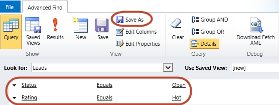
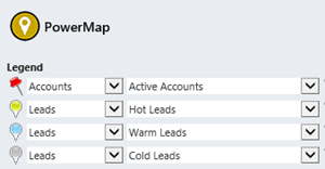
Suppose you want to see where your existing customers are spread, where your highest potential lies and whether there is a pattern. To do this, you'll be looking at Accounts (existing customers) and Leads (potential customers). Within Leads you can use different pins for Hot Leads, Warm Leads and Cold Leads, based on views that you create for the purpose of the map.
Here's how it works:
Below is the outcome of all this hard work.
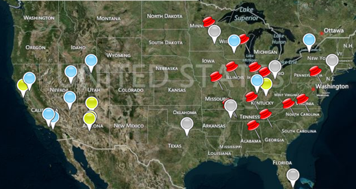
You can see in this example that although most of the accounts are from the Midwest and East, the hot and warm leads are concentrated in the West. Perhaps this indicates that my campaigns in that region have made an impact and the business has good potential there. That's great information—all from a PowerMap!
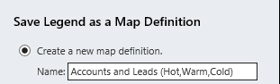
To save yourself the trouble of re-creating the legend the next time you want to see this map definition, you can save the map definition.
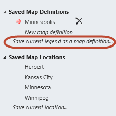
Now you can just click on this definition on the configuration pane next time and also be able to share it with others.
There you go--PowerMap makes it easy to plot multiple views of one entity!
Happy CRM'ing!